Productivity Palette: A Guide To Working With Colour
Optimising employee output has a lot to do with the hues you choose when it comes to your office décor. A study by Texas University found that employees are influenced by the colours of their surroundings, so it’s worth approaching your interior design with intent. The right colours can contribute to the overall wellbeing of your staff (which is paramount to a maintaining an industrious workforce) as well as creativity, focus and innovation. Here’s some advice to help you find the right colour for your space.
1.Red & Pink 
According to the practise of colour therapy, red and pink stimulate your blood, breath and overall circulation. Be careful here – creating a frisson with these energetic colours might be good for a productive burst, but overall they can be hyper-stimulating and lead to anxiety. Red can also hamper analytical thinking, so be mindful of where you use it.
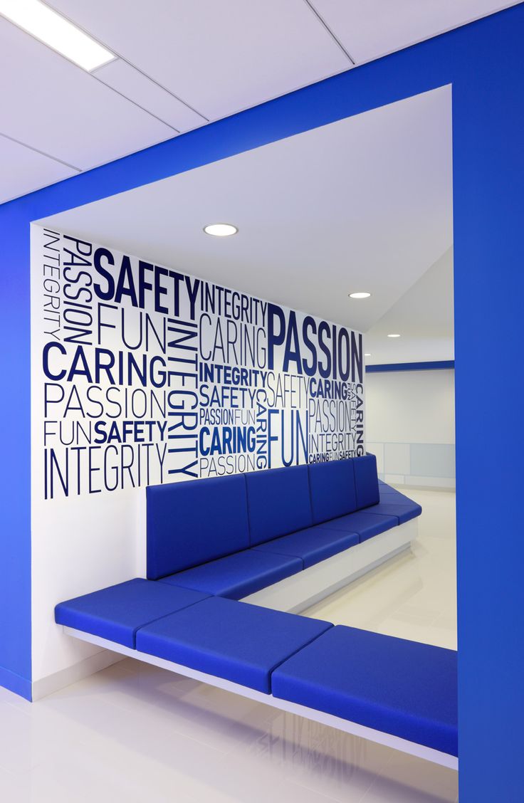
2. Blue
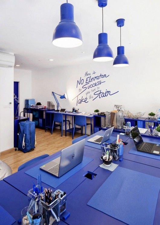
Just like gazing at the sky and the sea, natural cool blues are linked to lowering blood pressure and calming the mind. Blue is used in colour psychology to help diffuse situations of stress and tension. It keeps everyone thinking clearly, and therefore encourages sound productivity.
3. Purple
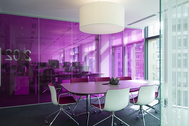
As a bridge between the contrasting primary colours of blue and red, purple is a happy medium between stimulation and stress-reduction. Dial down to lavender hues for more tranquillity, or ramp up the red tones for more energy.
4. Yellow & Orange
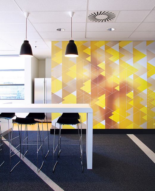
This is another colour group associated with creativity and innovation, establishing a sense of happiness and optimism. This is great for spaces created for brainstorming. Just watch the tone, as yellow is not necessary a well-loved colour – an overly saturated shade might have an adverse effect.
5. White
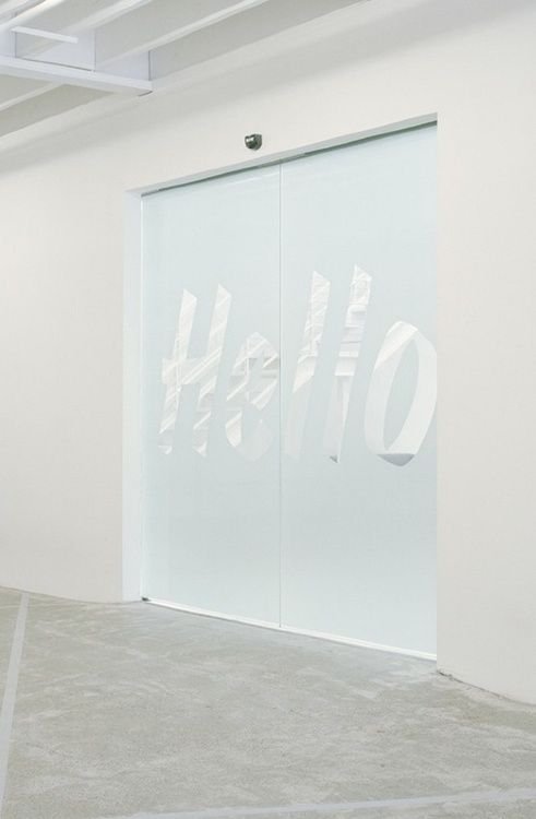
As a neutral non-colour, white has its uses in the right context. White is clean and crisp, and creates an impression of spaciousness. But too much of it and the walls can start closing in – it’s known to induce headaches and lend a sterile, clinical vibe to a space.
6. Green
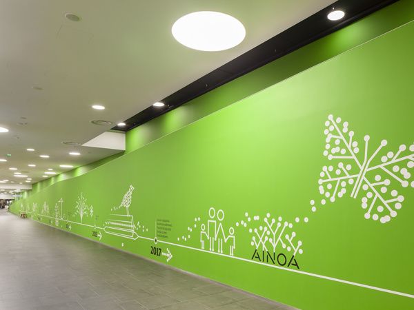
Another soothing hue, green is also linked to increased creativity, with connotations of spring and nature and growth. Go for a pastel shade with a low saturation to induce the right feels – and even contribute to healing and health.
E-Walls Studio designs mindful décor in high-stress environments, like hospitals, schools and offices. Get in touch to see how we can bring some colour into your place of work.